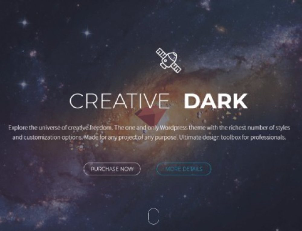
For any business website or blog, design is critical for gaining the visitor’s attention and boosting online sales and growth. If your website does not make an excellent first-impression on a visitor in the first few seconds, it is likely that you will lose a potential customer to a rival. Your WordPress website or theme design should consist of rich colors and videos, engaging text, and a smooth and structured layout and flow that can instantly make visitors mesmerized and make them your life-long customers.
This can only be done with the clever use of quality and professional website design tools and practices that an average website owner will hardly consider. Here are 5 essential WordPress design tips you need to know about that can boost your website’s appearance and viewing experience.
1. Use Rich and Engaging Images
Visitors look for instant gratification and what better way to quench their thirst than with large quality images? Your website’s home page should include rich and HD quality images that have the ‘wow’ factor to immediately stun visitors and capture their attention. One of the most common mistakes made by businesses is their poor choice of images. Of course low quality images are free, but if you are a recent business that wishes to establish a solid impression on customers, investing in impressive images is definitely worth every penny.
If you do not have a budget large enough for purchasing quality images, there are many free photo resources you can use, such as Unsplash, for a database of quality photographs.
2. Ensure Design Is Responsive
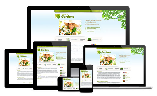
The more responsive your website is, the more seamless the visitor experience will be. Responsive design means that the website can easily adjust to different platforms and devices, such as mobile phones. Customers are making more online searches from mobile phones and if your website is not mobile-friendly, you will not only lose potential customers, but also suffer from lower search engine results.
3. Ensure Proper Web Layout
Visitors to your website will look for how the text, images, links, and videos are structured. A good layout can make the difference to how accessible website content and navigation and, more importantly, how high it ranks on search engine results. Design your website from a visitors’ standpoint and consider how each element should be organized for a better browsing experience.
4. Don’t Fill Your Website
The assumption ‘more is better’ certainly does not apply to good web design and can make it look unprofessional and messy. Having a little bit of white space does not matter. In fact, the more white space your website has, the cleaner and de-cluttered it will appear to visitors and also make it easier to read and see content.
5. Keep Your Colors Simple
Unless you have experience, don’t bother experimenting with tons of colors on your website. There is no point turning your website into a kaleidoscope. Pick two or three colors that signify your brand and ethos and keep it as simple as possible.
Now that you have these handy tips, design your website, optimize and host it on FastWebHost for the best managed WordPress hosting experience like this.

 Phone: 1(877) 215.8104
 Login
Login


Leave a Reply